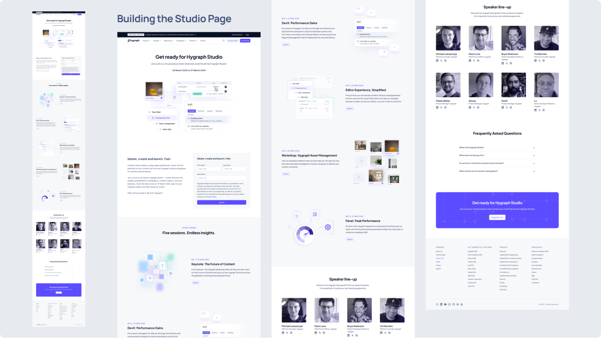
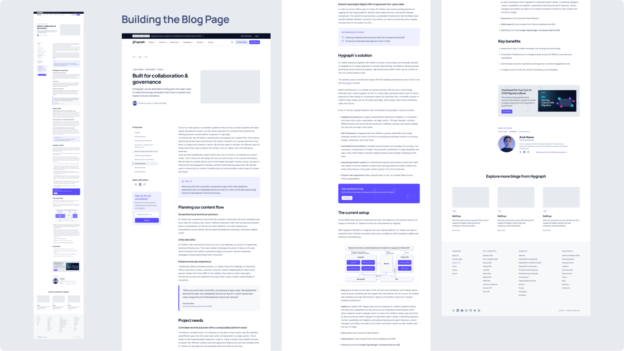
As you read in the introductory part of how we use Hygraph at Hygraph, we realized at some point that to scale faster as a company and to use our marketing resources more effectively, we needed a system that made it easier for us to build new pages faster on the website without being too dependent on the design and development resources.
If you haven’t read the first part of the series yet, go through it here to better understand why we decided to invest our resources into building this system.
#A quick overview
The first part of the process was to build a design system on Figma, that could be later translated to the codebase and the CMS as well. We call our marketing design system inside Hygraph Gestalten. It’s an organized whole that is perceived as more than the sum of its parts. While I take you through the process of how we built it, you’ll know why this name fits the bill perfectly.
We approached the design system in 4 stages, from essential elements to the final pages. We shall dive deeper into these segments, but here’s an overview of the steps:
- Building the foundation: colors, typography, spacing, shadows, and all the primitive elements
- Building the components: using the foundation elements to create buttons, links, form fields, etc.
- Building the blocks: sections where we combine the foundation elements and components to create reusable website blocks, e.g., the hero section, the feature section, the callouts, etc.
- Building the pages: the last step is built using all the existing blocks and components
#Laying the foundation
To build a house, you need bricks, concrete, steel, water, etc., and this step was analogous to gathering those essential elements. Even at the first step, we needed to build everything from the ground up, as our brand had existed for some years already, so the idea was to enhance those further.
Colors
This step was the most interesting, and we had the most fun experimenting. We decided to create a pool of colors that would only be on Figma (and could also be used for other brand assets outside the website) and then derive a subset from it as the web palette. The hues were a mix of what was already existing for our brand and some status colors.
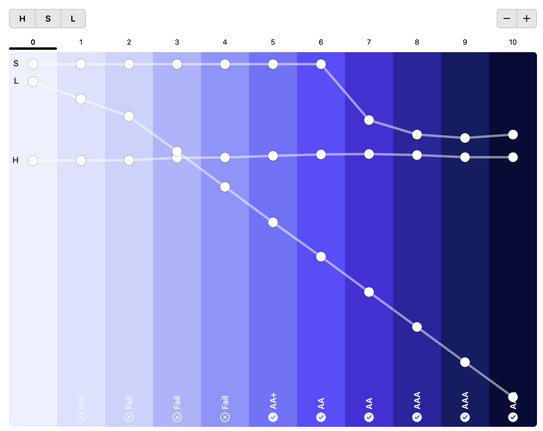
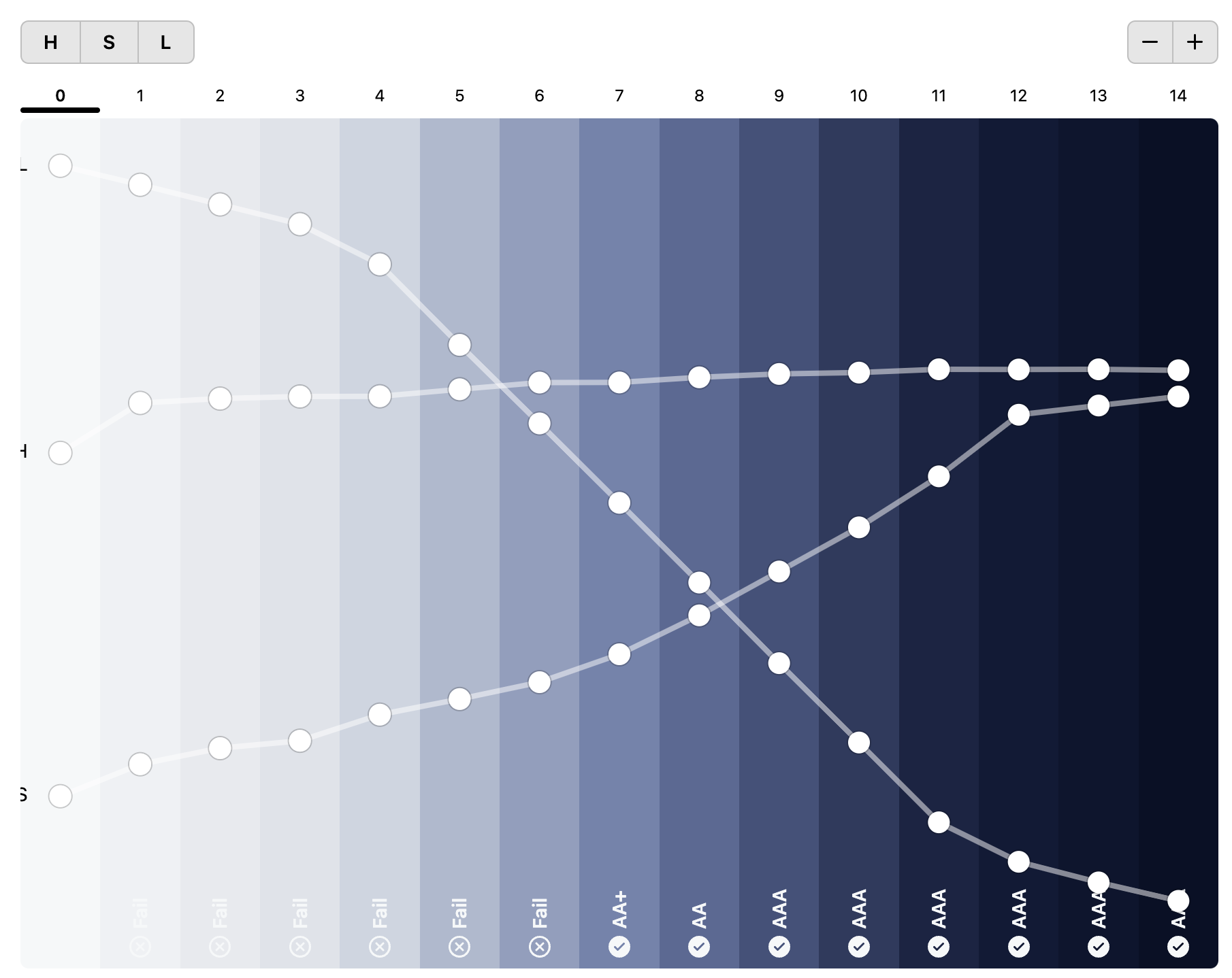
Once this was done, we decided upon HSLuv as our main color space, given its accessibility benefits and human-readable nature. While picking colors, we have always been cautious with accessibility scores as a critical factor. To build the color palettes and keep similar levels of saturation and lightness value, we used Github’s Primer Prism.
This helped us be more intentional about different colors while ensuring they were cohesive. When it came to naming the tokens, we relied on the lightness value for each hue so that different hues with the same lightness levels shared a suffix (indigo-100, indigo-200, indigo-600, and so on), and if a particular hue needed more tones, we could add them in the middle.
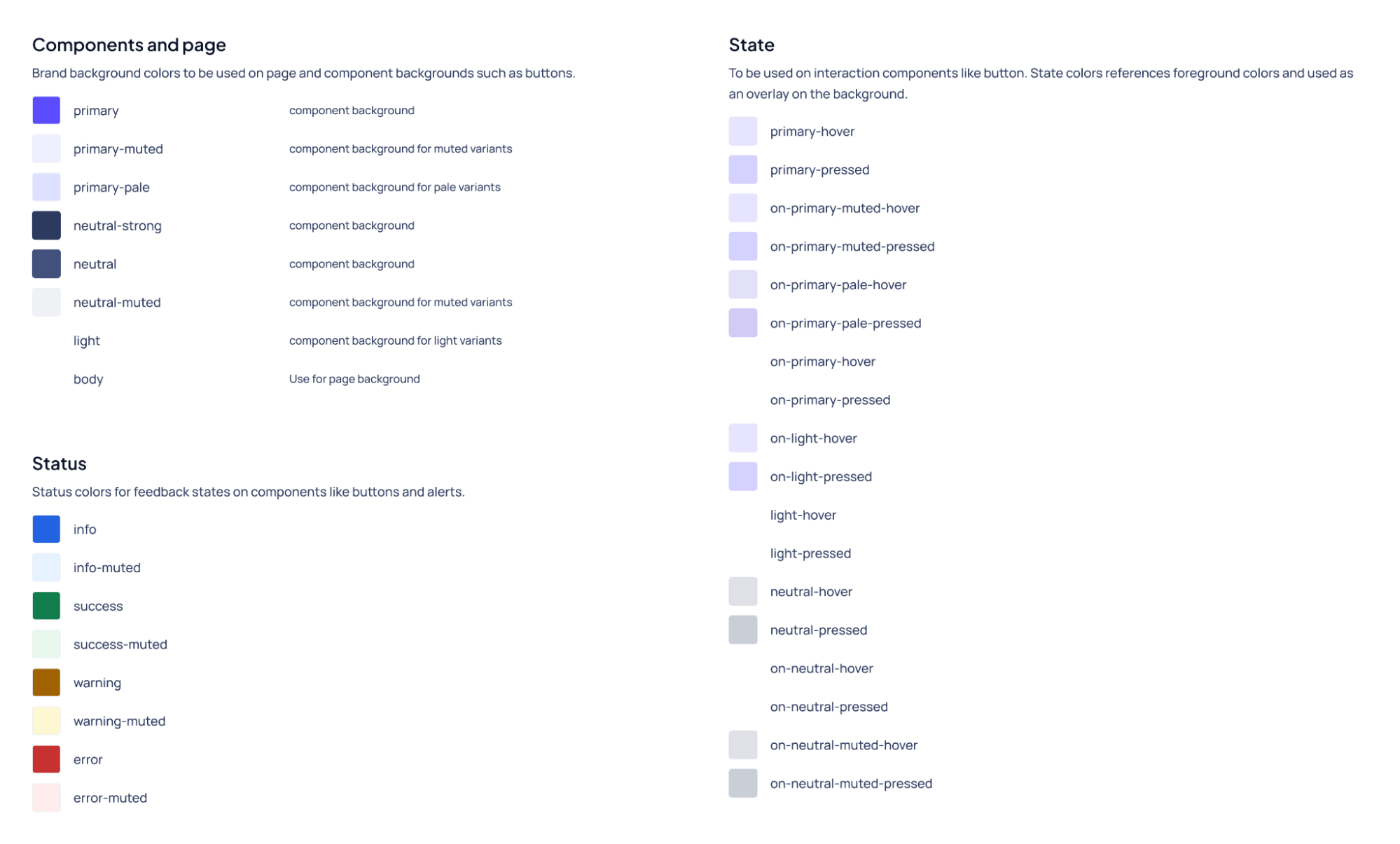
Now that we had a core palette, the next step was to generate a web palette that would later be added to the code. The most crucial factor here was naming the color tokens. We were inspired by Google’s Material Design here and took the semantic route where the token names were based on the color usage and not the exact hues. We did this to ensure that anyone using this system would easily understand where to use what and wouldn’t have to do any guesswork.
This also makes changing any colors foolproof. Hygraph’s current primary tokens are based on indigo, but five years down the line, if we want our primary color to be teal, our system is very adaptable to that change. We have been particular with the naming here, and even if two different tokens refer to the same hex value, they will both be living in the same system under different usage categories. This also helps us avoid any confusion around which colors to use for other states, like hover and pressed.
Typography
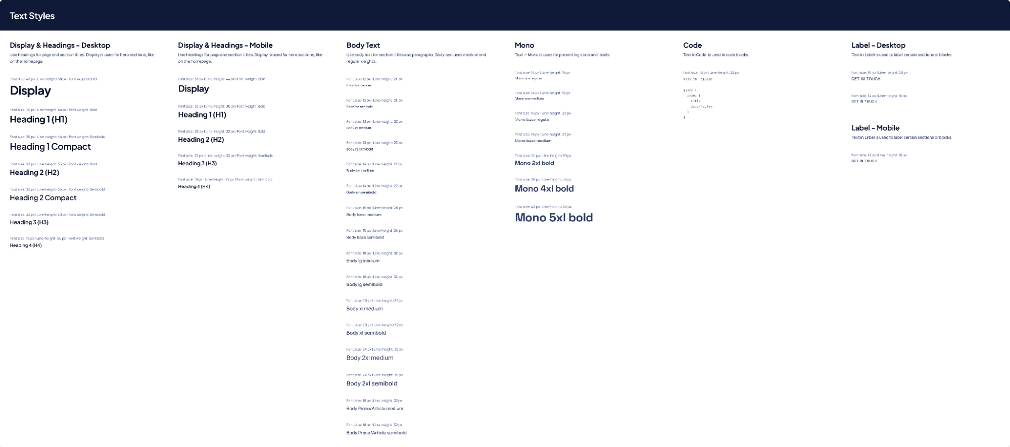
We use four typefaces at Hygraph, all designated with a specific purpose
- Plus Jakarta Sans: Headings
- Manrope: Body text
- Space Grotesk: Mono font for labels and specific tabs
Source Code Pro: Code blocks
Once we were sure of the typefaces, we combined them with different attributes like line height, tracking, font-weight, etc., to create typography tokens for different variants for all the possible use cases on the website. We used a progressive line height system for body text, where the font size and the line height factor go up, too. For situations where we needed bigger blocks of text, like on a blog, the line height was increased further for better readability.
Icons
We wanted to keep things straightforward and scalable here, so we decided to use the icon library from Untitled UI because it has 1000+ icons for different use cases, and they visually aligned well with our brand.
Spacing, shadows, radius, and other effects
Since all the design elements had to be connected to code and needed to have a uniform set of values, along with our developer, we decided to stick to the default Tailwind values for many different foundation elements like spacing, margins, shadows, radius, blur effects, etc. This process helped us move faster without compromising on the quality. Given that Figma has added new variable features, it also helps us use the same variables and a shared language as we evolve.
#Connecting Token Studio
It was finally time that we could start investing in dev resources in parallel to the design work, but we needed a way to be quickly on the same page in case we needed to make any changes. Here comes Token Studio.
Our system was built before Figma introduced native variables, so we depended on Token Studio. This is still our most used plugin, making the collaboration between design and development much smoother. We can also easily sync our earlier efforts with the new variables introduced to Figma.
#Structuring the basic components
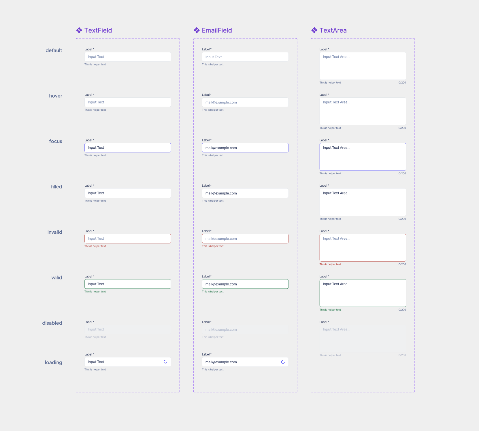
Once the foundation elements were decided and ready to be used, the next step was to start putting these together to form components. These include buttons, pills, tags, avatars, form fields, etc. This bit was about keeping usability and versatility in mind, and I had to ensure each component covered different interaction states, sizes, themes, and style variants.
While most of our current website has a light theme, we wanted to keep the possibility of adapting things later if we add accent colors or dark theme components.
#Block by block
With the essential components in place, we could now start thinking about the actual pages, and the first step was to break them down into different blocks. While this is one segment where we’re constantly improving to keep the system more adaptable and better looking, We still had to start somewhere. Many what-ifs, observations, and collaborations also led to this part.
Situations like,
- What if we add an email field to a feature section?
- What if the description copy needs to be longer?
- What if one of the cards in a grid is too long compared to the rest?
- What if we place this section on a light grey background instead of white?
Observations like,
- How many cards did we generally use on our old website?
- What are the different ways we’re using our callouts, and on which pages?
Are there any pages where we’re breaking down our feature sections into further details?
Over the months, we tried to address all this and more, but working on this segment has made me realize the importance of collaboration with content writers while building and using a design system. No matter how concrete your marketing design system can be, there will always be situations where your copy might look good on one page and not on another, even if they’re using the same blocks. In such cases, it’s helpful to sit with the content writers and develop a middle ground that doesn’t hurt the visuals while still communicating the message effectively.
#Building the pages
After months of work, we could finally see the bigger picture and start designing pages for our website. Once we listed all the needed pages, we categorized them into dynamic and templatized.
Dynamic Pages
These pages use only reusable blocks; think of feature pages, use case pages, or any new landing pages where you could combine all the existing design blocks to communicate the message by mixing and matching different sections on a single page. These are very composable and can be used as you please. The editors only need to go to Figma and check the specific variant used (e.g., if the button is solid, muted, outlined, etc.) and the section padding values, and add it along with the copy to the CMS.
Templatized Pages
While we tried to make our building blocks very versatile, in some cases, we only needed a specific block on a single page and never needed to reuse them again; for example, pricing cards for the pricing page, chapter index, and navigation for the academy page. We wanted to avoid bloating the system by loading everything for each page and keeping these specific blocks as local components.
These templates also help me keep the designs consistent. A blog page can only look a certain way, so we wanted to avoid giving the editors the capability to add a custom hero or feature section inside the blog page. This way, it made sense to templatize certain pages that always follow the same structure and avoid confusion.
#Current State and Takeaways
Since we launched the current version of our website in July 2023, we have ensured that all the existing and new pages use the design system and source content from our own CMS. While this process has improved our efficiency and collaboration by many folds, we also acknowledge that a design system is always a work in progress. We’re constantly updating tokens, components, and sections to fit our business's varied needs.
It’s important to understand that a marketing design system works very differently from a product design system. We must keep multiple audiences in mind, including the editors from our marketing team and the features inside the CMS. We had to ensure that we built the components in a very easy-to-consume manner on Figma so that the editors could quickly inspect the variants and replicate them on the CMS.
In hindsight, I have also realized that we could have done many things differently, and we’re constantly investing resources to improve these aspects:
- When we started, we ensured our color pool was diverse enough to address different UI needs. However, as time passed, these colors didn’t work well for other assets, and we had to revisit this multiple times. When approaching a marketing design system, it’s essential to test the colors for different use cases, social media, ads, print, etc., and then have subsets for different brand categories.
- Given the fast-paced nature of marketing teams, sometimes we rush to create new components that might not be 100% aligned with all the previous components and tokens. To solve this, we gather as a team occasionally to inspect such discrepancies and see how we can best address them.
For something so complex, it’s essential to consider the available tools and find solutions together. For example, we could not use size tokens before Figma introduced variables, which affected communication with developers. So, we used to manually check if the values we wanted to use were available in Tailwind. This removed the pressure of being restricted by features while keeping us aligned.
Seeing Gestalten take shape and evolve as a system has been an exciting journey. We did not have anything like this when I joined Hygraph two years ago, and spending so many months on this project has been one of the most fulfilling parts of my design career. It all started with a brief to make our brand more consistent across channels, and I haven’t looked back since. I can’t wait to enhance it further.
In the following parts of this series, you’ll become familiar with the development side of this project and how our editors have been using this system. If this has inspired you to build a design system for your website, too, and you have some questions, I’d be more than happy to help.
