Button with social links
#Overview
Join our community to suggest new recipe ideas!
This guide shows how to build a button component for your socials. It contains a dropdown for selecting social network icons, and a string field to add a link.
You can add this button to your project wherever you need to include icons that will link to your social networks.
We've created this as a component that you can later add to a model in your project as a component field. If you configure this field to allow multiple values, it will let you add different social links to a content entry.
 Button component with social links
#Core concepts
In this guide, you'll work with enumerations, components and basic component fields. Let's look into these concepts:
-
Enumerations: an enumeration is a predefined set of values that represents a list of possible options. You can use them to group values within a type.
-
Component: a pre-defined set of fields that can be reused across models and content entries. You can think of a component as a flexible, reusable template: you define the fields that will be used inside a component once, and then fill them with different content every time you use it in a content entry.
-
Basic component field: a component is a special field type in your Hygraph schema that defines which components of which type can be used in a model. Component fields can be of basic or modular types. A basic component field can only have one component attached to it. You can limit the number of component instances to one, or allow multiple component instances to be added in the content entry.
#What you can do
This guide offers two paths:
- Path 1: Use this guide to create a social links component that you can reuse across different models in your Hygraph projects.
- Path 2: Clone the project that contains the entire Buttons cookbook to compare the different button configurations without having to clone multiple projects.
#Step-by-step guide
Before we can build components, we sometimes need to create other schema elements that will later be added to those components as instances.
To make this guide easier to follow, we've divided it in steps for you.
#1. Create an enumeration
We will start by creating an enumeration that we can later add to our components as a dropdown menu for the social icons. To do that, we'll navigate to our project schema and click +Add next to Enumerations.
We'll use the following information to create our enumeration:
| Field | Input |
|---|---|
| Display Name | Social icons |
| API ID | SocialIcons |
Next, we need to add enumeration values. These are the options we will get when using this later as a dropdown menu.
For every enumeration value, you need to enter a Display name, an API ID, and click Add.
We'll add the following values:
| Display name | API ID |
|---|---|
| X (Twitter) | xTwitter |
Finally, we'll click Add enumeration to save.
#2. Create a component
Now that we've created the enumeration we're going to use later, we can build our social links component. To do this, we'll click +Add next to Components.
The first step is to create the component itself. We'll use the following information:
| Field | Input |
|---|---|
| Display Name | Social Link |
| API ID | SocialLink |
| API ID Plural | SocialLinks |
We'll click Add component to save.
We can now start adding instances to this component.
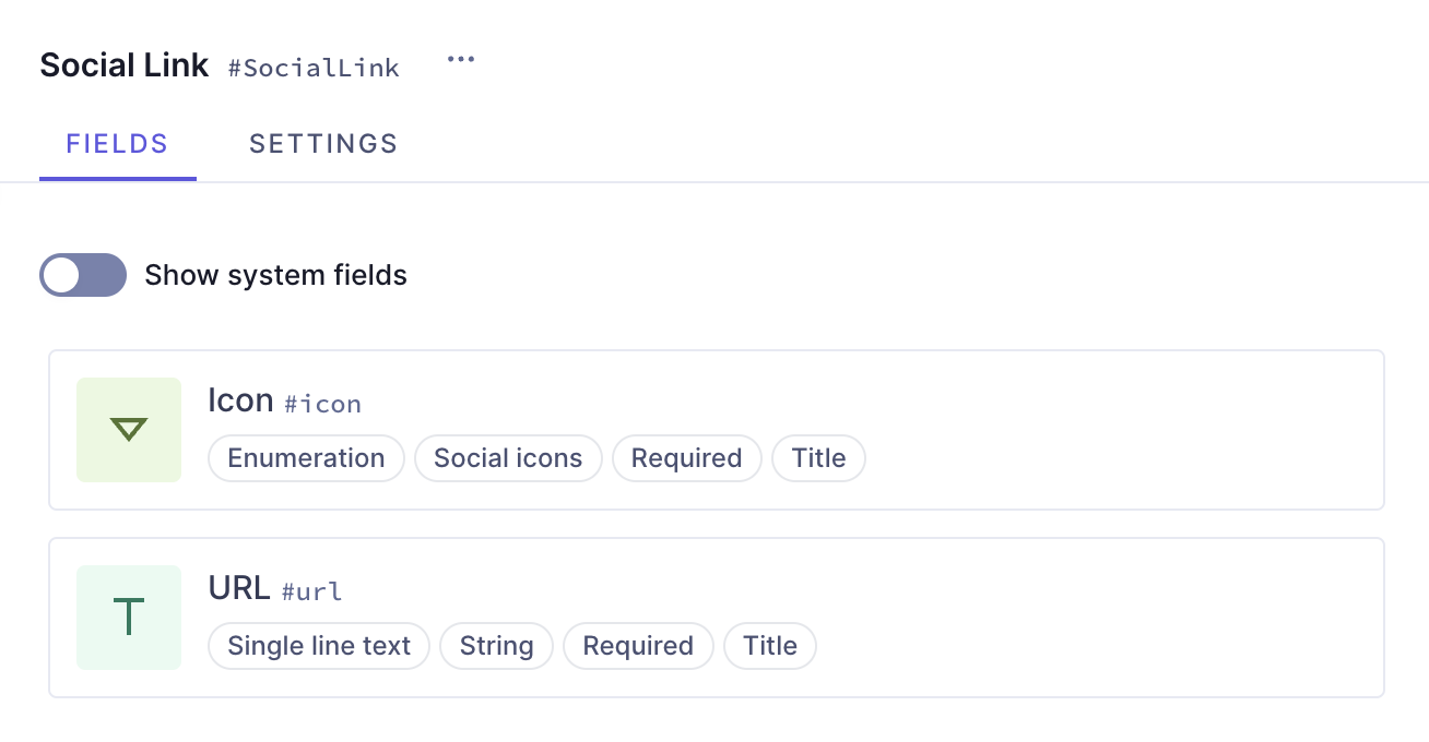
Let's start with an Enumeration field, which will be our dropdown menu. We'll find it on the Add fields right sidebar, click on it, and use the following information:
| Tab | Field | Input |
|---|---|---|
| Settings | Display Name | Icon |
| Settings | API ID | icon |
| Settings | Enumeration | Select "Social icons" from the dropdown menu |
| Settings | Use as title field checkbox | Leave this checkbox selected |
| Validations | Make this field required checkbox | Select this checkbox |
We'll click Add to save.
With this configuration, we've ensured that our enumeration field will use the social icons enumeration we created earlier, and will also be a required field.
Finally, we will add a Single line text field, so we can later add our URL as a string. We'll find it on the Add fields right sidebar, click on it, and use the following information:
| Tab | Field | Input |
|---|---|---|
| Settings | Display Name | URL |
| Settings | API ID | url |
| Settings | Use as title field checkbox | Leave this checkbox selected |
| Validations | Make this field required checkbox | Select this checkbox |
We'll click Add to save.
Our URL string field is also required, ensuring the social icons we select will have a link to match.
This is one way to build a social links button component in Hygraph. You can add this component to different models in your schema.
 Button component with social links
This guide helped you create the schema element yourself. Alternatively, you can clone a project containing all our button recipes.
Check out the next document section for that!
#Clone project
We have prepared a project that contains the entire Buttons cookbook:
Clone this projectThis cookbook contains all the recipes we have so far to create buttons, so you can compare the different button configurations without having to clone multiple projects.
To find this particular recipe in the cookbook project, navigate to the schema and look for "Social links".
This project also contains a demo model that includes all the button components as basic components, as well as a modular component that you can use as a button type selector.
#Useful links
We have more resources for you!
- Simple button: Look into the simplest possible way to build a basic button component in Hygraph.
- Styled button: Learn how to build a button component that uses dropdown fields for style selection, and contains a toggle button to indicate if the link is external.
Join our community to suggest new recipe ideas!