Card grid with references
#Overview
Join our community to suggest new recipe ideas!
This guide shows how to build a card grid component that uses reference fields to relate content to an entry.
This card grid contains a number field so you can indicate how many columns the grid should have, a reference field that lets you relate content entries in your project as cards, and dropdown menus to select the size of the gap between cards and the theme.
It is a good option when you need to show content entries in your project as cards. A good example of this would be a card grid showing related entries, such as products.
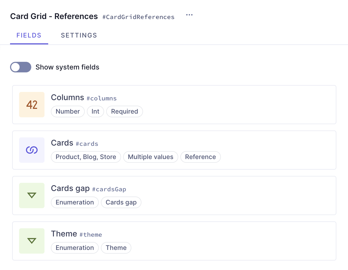 Card grid with references
#Core concepts
-
Enumerations: An enumeration is a predefined set of values that represents a list of possible options. You can use them to group values within a type.
-
References: References are relations between two or more content entries in your project. With references, you can reuse content entries by connecting them. Once the relation is configured, you can also use it to create related content from the content creation screen.
-
Component: a pre-defined set of fields that can be reused across models and content entries. You can think of a component as a flexible, reusable template: you define the fields that will be used inside a component once, and then fill them with different content every time you use it in a content entry.
#What you can do
This guide offers two paths:
- Path 1: Use this guide to create a card grid component that you can reuse across different models in your Hygraph projects.
- Path 2: Clone the project that contains the entire Card Grid cookbook to compare the different card grid configurations without having to clone multiple projects.
#Step-by-step guide
Before we can build components, we sometimes need to create other schema elements that will later be added to those components as instances. We will divide this process in steps to make it more manageable:
- Create the enumerations: We will need to create enumerations so that we can later on use dropdown menus to select different styling options.
- Create models: We will create three models so that we can select them as referenceable by the grid.
- Create the card grid: Finally, we'll combine all the elements we worked on before to our card grid.
#1. Create the enumerations
We will start by creating an enumeration that we can later add to our card grid component as a dropdown menu to select the gap size between our cards on the grid.
We'll navigate to our project schema,click +Add next to Enumerations, and use the following information to create our enumeration:
| Field | Input |
|---|---|
| Display Name | Cards gap |
| API ID | CardsGap |
We'll click Add enumeration to save.
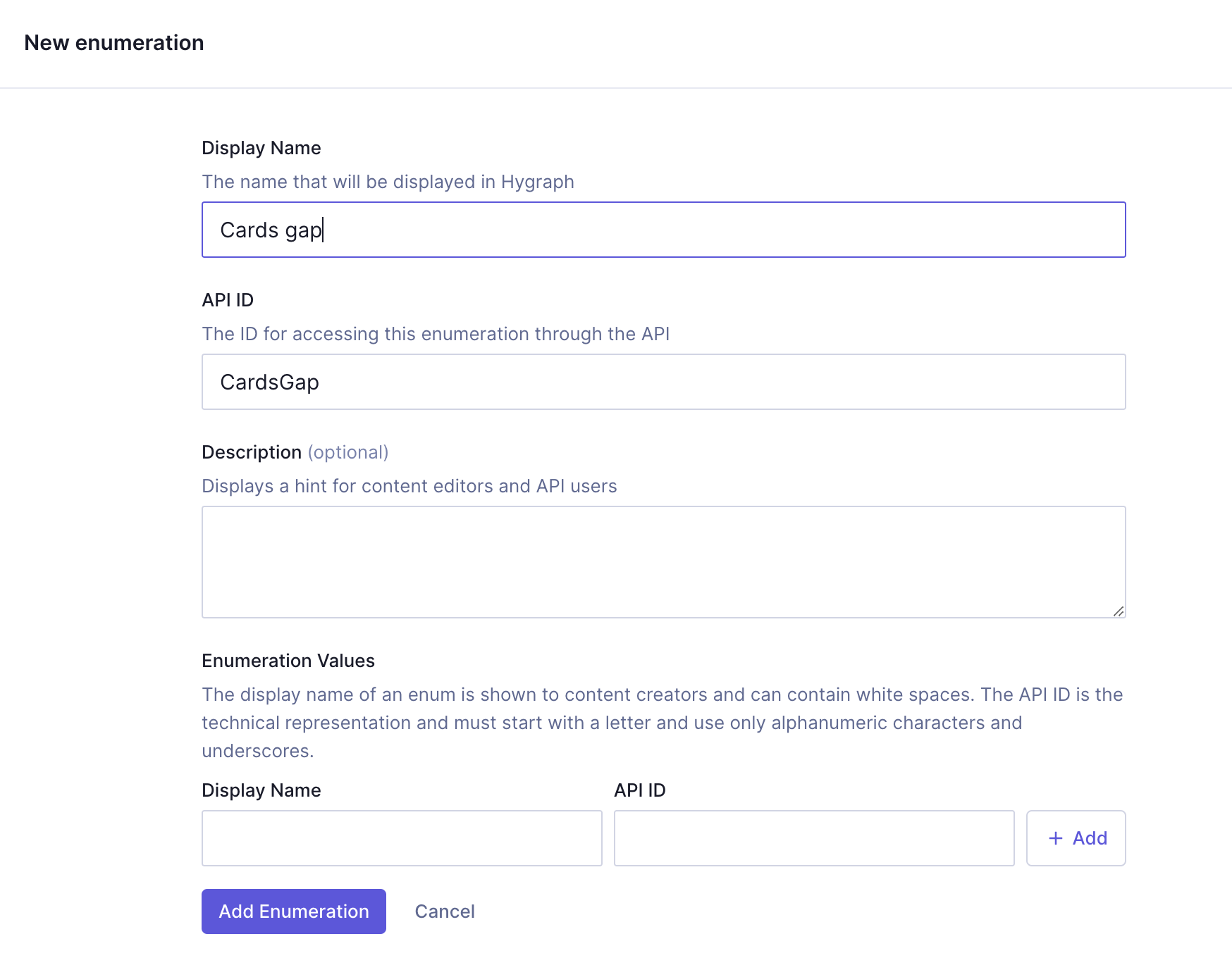 Card grid with references - Cards gap enumeration
Next, we need to add enumeration values. For every enumeration value, we need to enter a Display name, an API ID, and click Add.
We'll add the following values:
| Display name | API ID |
|---|---|
| Large | large |
| Medium | medium |
| Small | small |
Finally, we'll click Add enumeration to save.
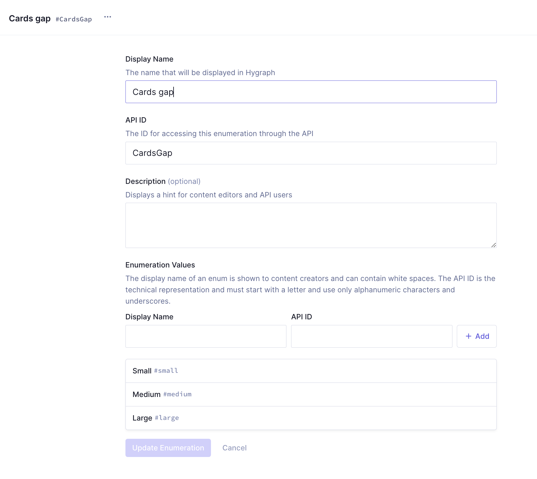 Card grid with references - Cards gap enumeration values
#2. Create models
This card grid configuration will use references to link entries from models in our schema.
In a real situation, you would use actual content models that you planned and built for your project, but for the sake of this example, we will simply create three empty content models so we can later on reference them.
| Field | Input |
|---|---|
| Display Name | Product |
| API ID | Product |
| API ID Plural | Products |
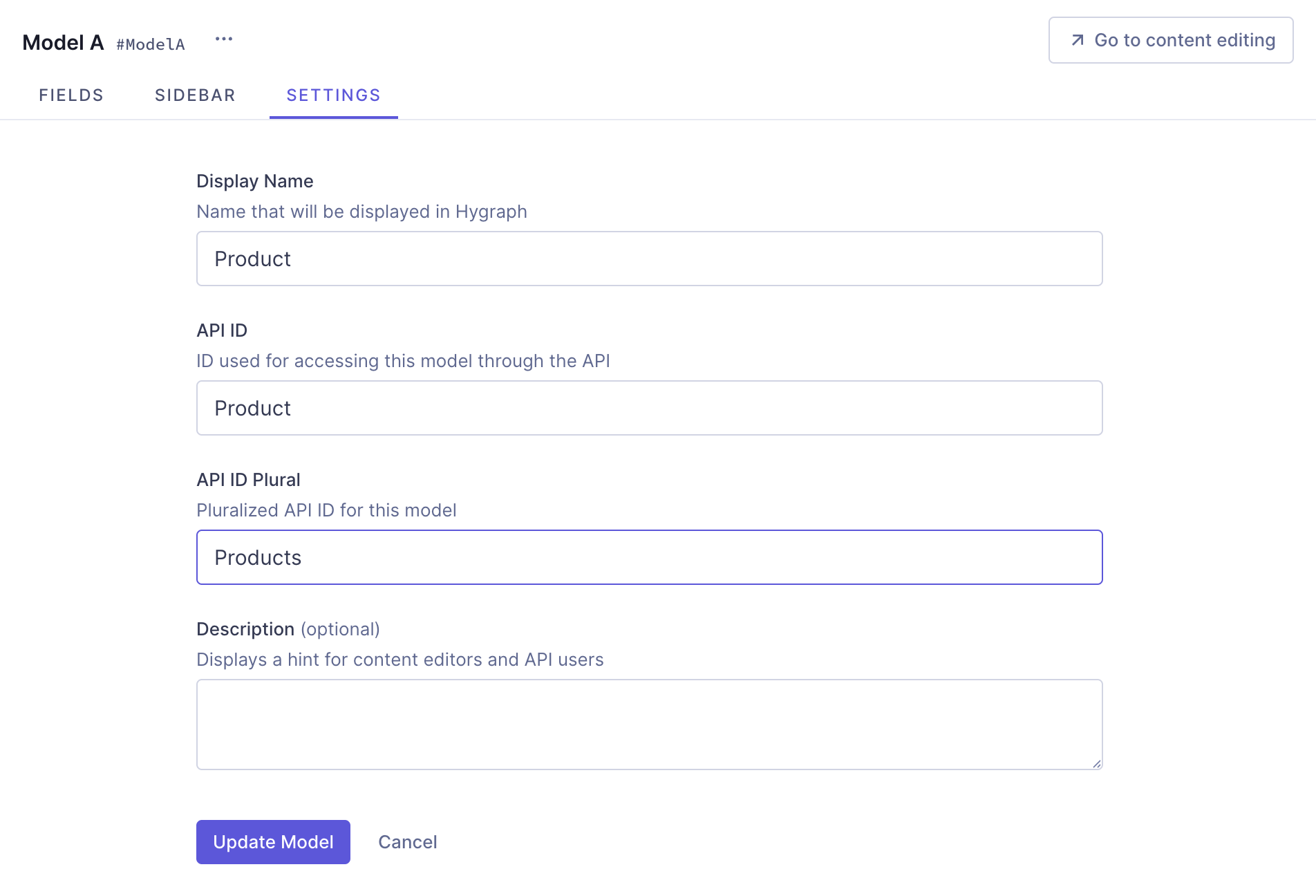 Card grid with references - Models
We'll click Add model to save.
Next, we'll create our second content model using the following information:
| Field | Input |
|---|---|
| Display Name | Blog |
| API ID | Blog |
| API ID Plural | Blogs |
We'll click Add Model to save.
And one final time for our third model:
| Field | Input |
|---|---|
| Display Name | Store |
| API ID | Store |
| API ID Plural | Stores |
We'll click Add model to save.
These are the three content models that we will include in our reference when we create the card grid.
#3. Create the card grid
At this point, we've created everything we need in order to start working on our card grid component.
We'll click +Add next to Components and use the following information:
| Field | Input |
|---|---|
| Display Name | Card Grid - References |
| API ID | CardGridReferences |
| API ID Plural | CardGridReferencess |
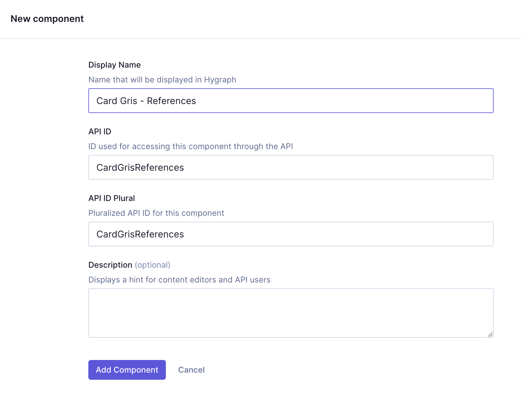 Card grid with references - Component
We'll click Add component to save. We can now start adding instances to this component.
Let's start with a Number field, which we can later use to indicate the number of columns on our grid.
We'll find it on the Add fields right sidebar, click on it, and use the following information:
| Tab | Field | Input |
|---|---|---|
| Settings | Display Name | Columns |
| Settings | API ID | columns |
| Validations | Make field required checkbox | Select this checkbox |
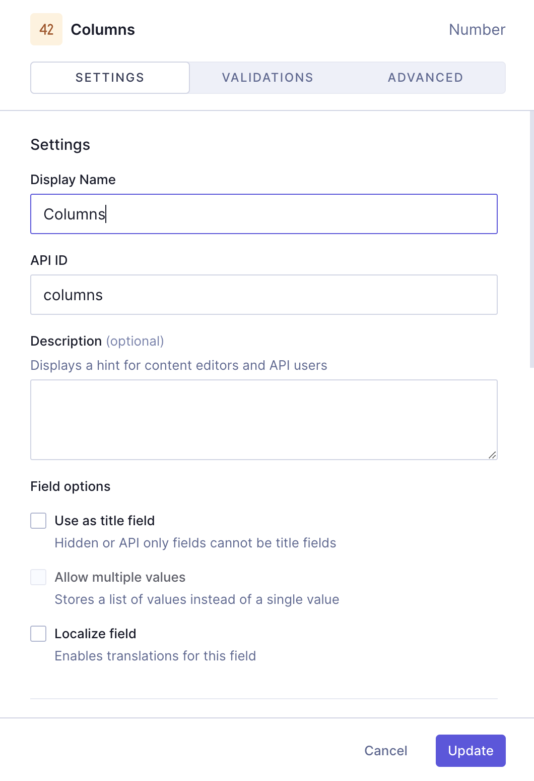 Card grid with references - Number of columns
We'll click Add to save.
Earlier, we created three empty content models. We will now add them as part of a Reference field so when we use the card grid component, we will be able to relate content entries from those models. The entries we reference will be included as cards in our grid.
We'll find the Reference field on the Add fields right sidebar, click on it, and use the following information:
| Tab | Field | Input |
|---|---|---|
| Define | Reference type | Select Allow multiple models to be referenced (Union Type) |
| Define | Models to reference | Use the dropdown menu to select Product, Blog and Store |
| Define | Reference direction | Select One-way reference |
| Define | Allow multiple... checkbox | Select Allow multiple Product, Blog, Store per CardGridReferences |
| Configure reference | Display Name | Cards |
| Configure reference | API ID | cards |
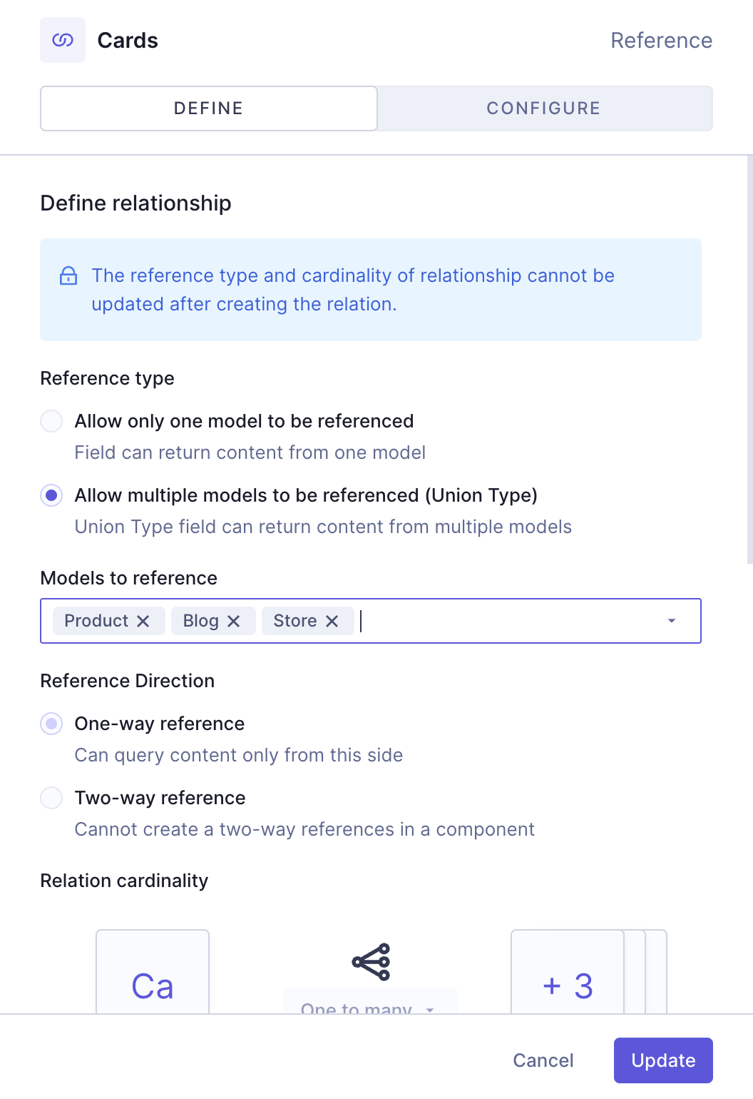 Card grid with references - Reference field
We'll click Add to save.
In the case of this reference field, we created a one-way reference because we don't want to create a reverse field in the models we created earlier; and we allowed multiple values because without that we'd only be able to add a single card to our grid.
The final step will be to add Enumeration fields so we can later select the gap size between cards and the theme.
Let's start with the gap size. We'll find the Enumeration field on the Add fields right sidebar, and use the following information to create it:
| Tab | Field | Input |
|---|---|---|
| Settings | Display Name | Cards gap |
| Settings | API ID | cardsGap |
| Settings | Enumeration | Select "Cards gap" from the dropdown menu |
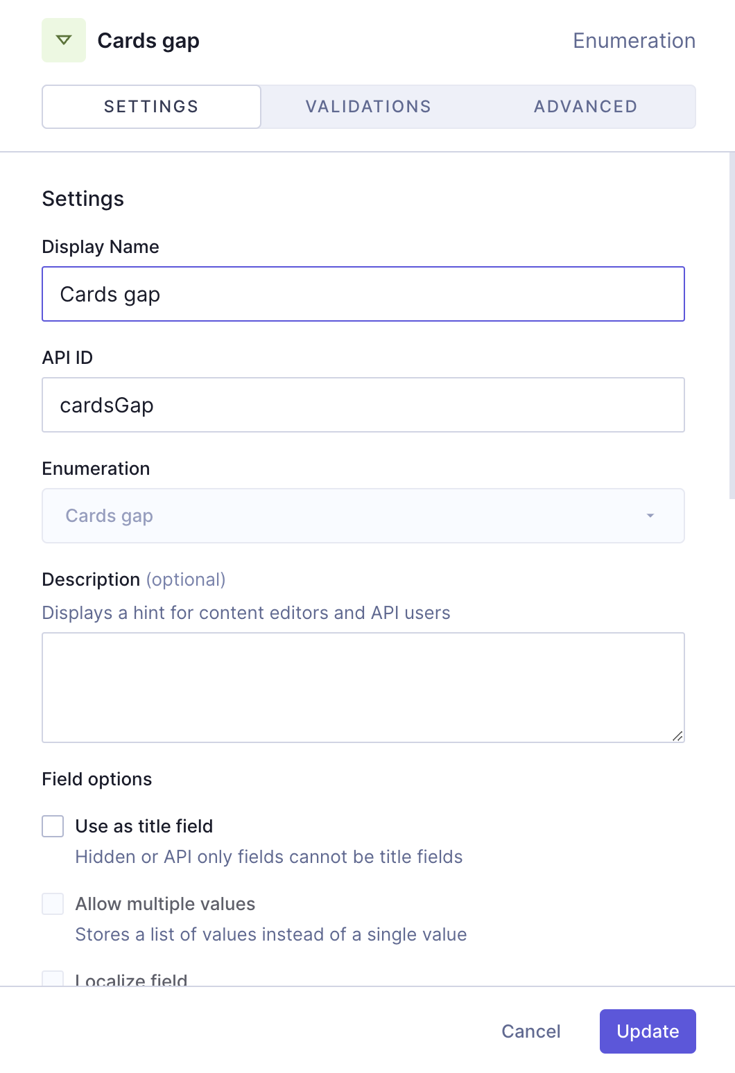 Card grid with references - Gap
We'll click Add to save.
Finally, we'll repeat the process to add the theme enumeration field:
| Tab | Field | Input |
|---|---|---|
| Settings | Display Name | Theme |
| Settings | API ID | theme |
| Settings | Enumeration | Select "Theme" from the dropdown menu |
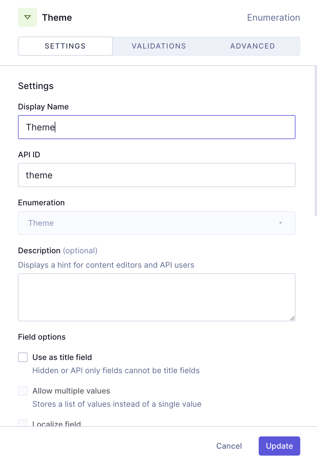 Card grid with references - Theme
We'll click Add to save.
We've created a card grid component that contains several schema elements for customization purposes and that lets us add existing content entries as cards.
 Card grid with references
This guide helped you create the schema element yourself. Alternatively, you can clone a project containing all our card grid recipes.
Check out the next document section for that!
#Clone project
We have prepared a project that contains the entire Card Grid cookbook:
Clone this projectThis cookbook contains all the recipes we have so far to create card grids, so you can compare the different card grid configurations without having to clone multiple projects.
To find this particular recipe in the cookbook project, navigate to the schema and look for "Card Grid - References".
This project also contains a demo model that includes all the card grid components in the cookbook as basic component fields, as well as a modular component field that you can use as a card grid type selector.
#Useful links
We have more resources for you!
Join our community to suggest new recipe ideas!